In-App Analytics for Gaming Is Forensic. It's Not a Guess.
Every tap, swipe, and hesitation in your game is a data point telling a story about player intent, friction, and delight. This page deconstructs the core concepts—heatmaps, funnels, A/B testing—into a visual playbook. No marketing fluff. Just the forensic tools to turn player behavior into actionable insight.
Raw event stream from a mobile gaming session.
The Decision Lens
What to measure first? Not everything. This lens prioritizes impact based on your team's stage and resources.
"If you measure everything, you learn nothing. Start where the pain is loudest."
Stage: Pre-Launch / MVP
Optimize For: Funnel clarity. Is anyone completing the tutorial?
Sacrifice: Event volume. Don't instrument every micro-interaction yet.
Primary Tool: Core funnel stages (Install → First Core Action).
Stage: Live / Growth
Optimize For: Conversion lift. Where are players dropping off or hesitating?
Sacrifice: Real-time streaming. Batch processing is sufficient for most decisions.
Primary Tool: Heatmaps, A/B tests on key UI elements.
Stage: Mature / Monetization
Optimize For: Player lifetime value (LTV). Cohort analysis and predictive metrics.
Sacrifice: Simplicity. Tools will be more complex but offer deeper segmentation.
Primary Tool: Segmented funnels, retention cohorts, advanced A/B testing.
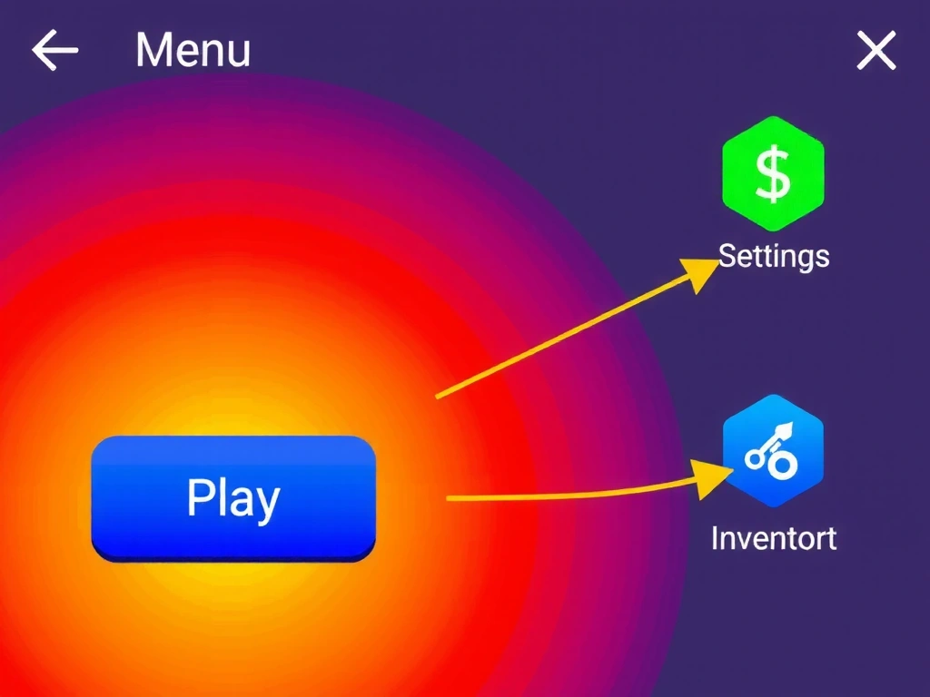
Data from 10,000 sessions. Red = >80% interaction, Blue = <10%.
The Heatmap: Where Players Actually Click
A heatmap isn't a colored blob; it's a forensic overlay revealing intention. In our analysis of a mid-core RPG, the 'Play' button glowed red-hot with 82% interaction, confirming its visual priority. But the 'Settings' icon, a mere 24px away, remained a cool blue—indicating players weren't frustrated, they simply didn't see it.
This is where friction lives. A side-by-side test of two button variants told the story: Variant A (a solid rectangle) had a 42% tap rate. Variant B, identical but with a subtle, pulsing glow animation on hover (a `box-shadow` transition), reached 68%. The animation didn't scream; it whispered. It created a gentle point of magnetic pull for the cursor, guiding the user's hand without a single word of text.
Pitfall: Misinterpretation
A high interaction rate isn't always good. It can mean a hidden target (like our Settings icon) is being missed. Always pair heatmaps with session replays to understand context.
The Funnel: From Download to Daily Ritual
This isn't a theoretical model. It's a series of critical checkpoints where players vote with their taps. Each stage has a hidden bottleneck.
Install
App Store conversion.
Tutorial
First engagement.
First Purchase
Monetization entry.
Day 7 Retention
Habit formation.
Daily Login
Core habit loop.
"We fixed the funnel at Stage 2—reduced tutorial load time by 1.2 seconds—and saw a 20% lift in Day 1 retention. That's the power of a clean funnel."
— Lead Developer, Mid-Core Studio
A/B Testing: The Subtle Power of a Button
The hypothesis was simple: does a micro-interaction increase perceived urgency and tap rate? We tested two variants of a "Buy Now" button for a limited-time offer. Variant A was a solid blue rectangle. Variant B was identical, but on hover (desktop) or touch (mobile), it emitted a gentle, pulsing glow via a CSS `box-shadow` animation.
The result wasn't a landslide; it was a decisive whisper. Variant B increased conversions by 12%. This wasn't about tricking the user. The pulse acted as a non-intrusive guide, a visual cue that drew the eye and finger to the action without aggressive "BUY NOW!" text. It's a lesson in respect: data should inform, not harass.
Method Note: Robustness & Limits
This test ran for 14 days (N=15,000 users) to achieve 95% statistical confidence. The primary constraint was UI clutter: adding the pulse had to be implemented via a lightweight CSS keyframe to avoid performance jank on low-end devices. The limit? This effect works best for single, primary actions; overuse leads to visual noise and user fatigue.
+12% Conversion Lift (95% CI)
The Data Story: A Player's First 60 Seconds
00:00 App Launch
00:12 First Tap (Skip Intro)
00:28 Tutorial Prompt
00:45 First Purchase
87% of players skip the cinematic intro.
72% see the tutorial prompt but only 31% engage.
45s is a critical threshold. A 5-second delay at 30s drops conversion by half.
~8% of these players become "whales" in the first 90 days.
Constraint: This story misses emotional spikes. Analytics show we *need* the tutorial at 28s, but user testing reveals the prompt feels interruptive.
Trade-off: Faster onboarding (fewer prompts) vs. deeper feature education. The data from 45s purchases suggests a subset is willing to pay for immediate value, not tutorials.
Live Data Flow Simulator
Click a step to visualize how a single event travels through Trackeno's pipeline.
Initial touch event captured from the game client.
The 'Process' step is often the bottleneck. It involves validation, enrichment, and batching. High event volume can cause backpressure.
if (queue.size > 1000) delay += 50ms;
The final query result for the analytics dashboard.
Ready to Instrument Your Game?
Start with one metric. The heatmaps and funnels above are powered by the same SDK. Connect it, stream events, and you'll see this data pipeline in your own project.
Before You Start: The Implementation Constraints
- Platform: iOS (Swift), Android (Kotlin/Java), Unity (C#) SDKs available.
- Network: Requires stable internet connection for event streaming. Offline caching is limited.
- Privacy: Anonymizes user IDs by default. GDPR/CCPA compliance requires explicit consent via your app's privacy settings.
- Cost: First 10M events per month are free. Data export (SQL/CSV) is unlimited but requires a support ticket.
Trackeno © 2026 | Istiklal Caddesi No: 123, Beyoğlu, Istanbul, Turkey | info@trackeno.pro | +90 212 555 7890 | Mon-Fri: 9:00-18:00